
Why your AI coding assistant generates generic layouts by default, and how to ground tools like Cursor, Copilot, or Antigravity in raw design system manifests to build premium Next.js interfaces.
If you write open-ended instructions to your development agents—whether you are running Cursor, GitHub Copilot, Claude Code, or Antigravity—you will receive generic interfaces. I call this the AI-Beige standard: flat layouts, unconfigured shadcn primitives, default Tailwind border-radius configurations, and uninspired dark modes.
To build interfaces that match the visual calibre of Vercel, Stripe, or Linear, you must supply coding LLMs with strict aesthetic boundaries.
This article outlines the design-engineering pipeline I use on wistant.me (built using Next.js 16, TypeScript, Tailwind CSS v4, and shadcn/ui) to constrain AI models and force them to generate premium, highly customized UIs.
Alternative Title Options
- Escaping the AI-Beige Grid: A Design Engineer's 7-Step Protocol for Custom UI (Selected)
- Grounding Coding LLMs: Building Tailored Next.js Interfaces with DESIGN.md
- Beyond Generic Tailwind: The Design Manifest Strategy for Cursor, Copilot, and Claude Code
Why AI Coding Assistants Design Like Templates
When you ask an AI assistant to write a page, it does not have a visual memory or a built-in artistic taste. It operates entirely on statistical probability over its training set.
Without a target framework, it defaults to the median:
- Saturated, generic Tailwind colors and standard grays.
- Default shadcn/ui configurations with unadjusted padding and border radius values.
- Hard contrasts without depth, lacking gradients, borders, or micro-interactions.
The issue is not the capability of the model. It is the lack of context. By default, coding LLMs are style-blind. To correct this, we need to supply them with a machine-readable design contract directly in their workspace.
In design engineering, the gap between a Figma design file and production code is bridged by strict systems of tokens. LLMs are text-prediction models; they cannot look at a Figma board natively during a quick terminal refactor. However, they excel at interpreting strict text specifications. If you translate your design values into a code manifest, the AI will execute it as a constraint engine.
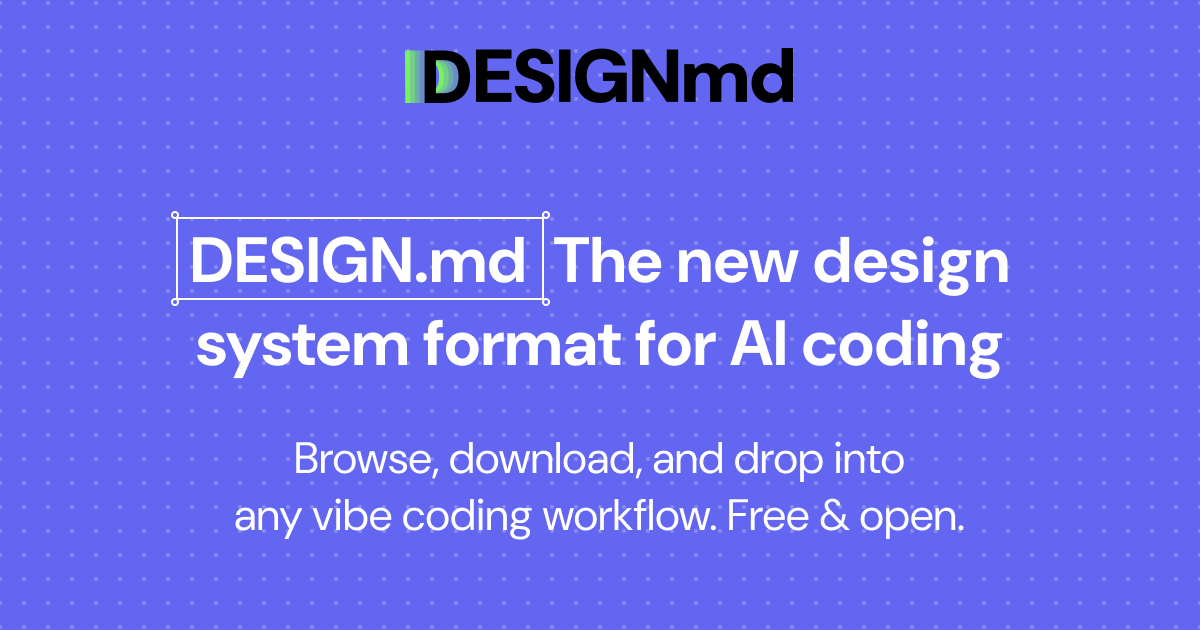
The Root Manifest: Introducing DESIGN.md
A DESIGN.md file is a plain-text markdown document committed to the root of your codebase. It defines the exact design tokens and coding boundaries that your AI model must follow when generating or refactoring UI components.
It uses two distinct sections:
- YAML Frontmatter: Machine-readable tokens (exact color maps in HSL/OKLCH, typography scales, container dimensions). Coding assistants read and parse this structure to configure global files.
- Markdown Guidelines: Clear semantic instructions (DOs and DONTs, spacing philosophies, interactive animation states) that the model injects into its system prompt logic.
A Production-Ready DESIGN.md for Tailwind v4
Here is the exact root manifest configuration I use to ground AI agents when building components:
---
brand: "Wistant Portfolio"
theme: "obsidian-dark"
tokens:
  colors:
    background: "hsl(240 10% 3.9%)" # Deep obsidian base
    surface: "hsl(240 10% 6%)" # Card background
    surface-hover: "hsl(240 10% 9%)" # Card hover state
    border: "hsl(240 5.9% 15%)" # Low-contrast separator
    text-primary: "hsl(0 0% 98%)" # Bright text
    text-muted: "hsl(240 5% 65%)" # De-emphasized text
    accent: "hsl(250 95% 60%)" # Violet accent
    ring: "rgba(99, 102, 241, 0.4)" # Soft blue-violet outline
  geometry:
    radius-button: "0.375rem" # Sharp premium radius
    radius-card: "0.625rem"
    border-width-default: "1px"
  transitions:
    smooth: "all 0.2s cubic-bezier(0.16, 1, 0.3, 1)"
  elevation:
    shadow-sm: "0 1px 2px 0 rgba(0, 0, 0, 0.05)"
    shadow-md: "0 4px 6px -1px rgba(0, 0, 0, 0.1), 0 2px 4px -1px rgba(0, 0, 0, 0.06)"
    glow-accent: "0 0 15px 1px rgba(99, 102, 241, 0.15)"
---

# Design System Rules

## Visual Hierarchy Constraints

- Always map background styles to local HSL css variables instead of Tailwind utility values.
- Modals, tooltips, and floating menus must implement a subtle glassmorphic effect: `backdrop-blur-md bg-surface/80`.
- Focus rings must use a low-opacity accent color with a thin offset border.
- Interactive cards must feature a subtle inner shadow or top-border highlight to simulate elevation.

## Styling DONTs

- DO NOT use arbitrary Tailwind border-radius values (e.g. rounded-lg, rounded-2xl). Map strictly to geometry tokens.
- DO NOT use generic gray classes (gray-800, zinc-900). Use the semantic obsidian theme palette.
- DO NOT introduce colored backgrounds for text containers; use flat dark surfaces with high-precision borders.
The 7-Step Protocol
This workflow integrates visual discovery with code generation by combining two specialized platforms:
- styles.refero.design: For analyzing interaction patterns and layout flows of existing applications.
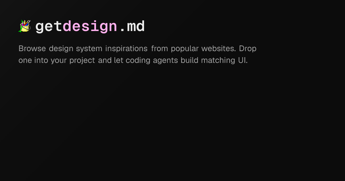
- getdesign.md: For extracting standard machine-readable
DESIGN.mdtemplates of known architectures.
- Step 1: Visual Discovery on Refero: Browse styles.refero.design to analyze layout interactions, transitions, and hover states of modern SaaS tools.
- Step 2: Manifest Selection: Visit getdesign.md to locate production-grade
DESIGN.mdmanifests of leading brands (such as Meta, Shopify, or Vercel). Select one matching your taste and frontend architecture. - Step 3: Root Commit: Copy the selected
DESIGN.mdfile directly to the root of your project repository. - Step 4: Phased Strategy Request: Prompt your AI coding agent (Cursor, Claude Code, Copilot, Antigravity) to read the root
DESIGN.mdand generate a multi-phase implementation or refactoring plan. - Step 5: Context Reset: Close your active chat or terminal thread and launch a brand-new, clean session to erase conversational logs and prevent context drift.
- Step 6: Phase Execution Loop: Direct the agent to implement the approved plan incrementally, phase-by-phase.
- Step 7: Verification and Commit: Run tests locally after each phase, check visual contrast, perform necessary manual fixes, and execute isolated atomic commits.
The Prompt Engineering Blueprint: Setting the Aesthetic Boundary
To initialize your development agent, you must explicitly inject the workflow steps into the prompt. This forces the model to respect the bounds of the protocol instead of falling back to default styling patterns.
Prompt Template A: The Green-Field Bootstrapper (Fresh Builds from Scratch)
Use this prompt when starting a new project or page module using a manifest copied from getdesign.md:
# PROMPT: Fresh Module Bootstrapping

We are building a new [Page/Feature Name] located at [Target Path].

We are executing Step 4 of our design-engineering protocol:

1. Examine the root DESIGN.md manifest which we copied from getdesign.md.
2. Verify that our stack uses Next.js 16, Tailwind CSS v4, and shadcn/ui.
3. Generate a 4-phase implementation plan to build this layout from scratch.
4. Your plan must list which files will be created in each phase (e.g., globals.css configurations, components setup, layout structures).
5. Acknowledge that in Step 5 we will open a new clean session, and in Step 6 you will build this phase-by-phase under our supervision.

Generate the plan now. Do not write any code files yet.
Prompt Template B: The Legacy Refactoring Engine (Aligning Existing Code)
Use this prompt when you have an existing layout that you need to align with a root DESIGN.md manifest:
# PROMPT: UI Alignment Strategy

We have placed a custom DESIGN.md file at our root, selected from getdesign.md to fit our brand. We need to refactor the current UI located in [Target Path].

We are executing Step 4 of our protocol:

1. Analyze the style differences between our current files in [Target Path] and the tokens/rules in the root DESIGN.md.
2. Outline a phased, step-by-step refactoring plan to align the layout.
3. List the styling deviations (e.g. custom border-radius values, generic colors, missing transition animations).
4. Do not modify any code. Output the audit and the plan, and wait for confirmation.
Prompt Template C: The Clean-Session Phase Executor (Incremental Building)
Use this prompt after you have completed Step 5 (restarting the session) and are ready to write code for a specific phase:
# PROMPT: Phase Implementation

We are at Step 6 of our protocol. This is a clean session.

We are implementing [Phase Number] of our approved roadmap: [Phase Description].
Rules:

1. Refer strictly to the root DESIGN.md manifest as your source of truth for color, border-radius, transition, and shadow variables.
2. Implement only the changes required for this phase. Do not bleed into subsequent phases.
3. Once completed, stop and let me compile the build so I can run Step 7 (visual verification, typescript validation, and atomic commit).
4 Real-World Integration Scenarios
Different frontend setups require different component structures. Here are four scenarios simulating how to guide an AI agent based on the primitive library you choose.
Scenario 1: Next.js 16 + Tailwind v4 + shadcn/ui (Obsidian Dashboard)
In this scenario, we guide the agent to override shadcn's base configurations using the Tailwind CSS v4 variables mapped from DESIGN.md.
# PROMPT:

"We are configuring our shadcn/ui components in Next.js.

Modify the CSS variables inside src/app/globals.css. Map our root DESIGN.md colors to shadcn's semantic properties:

- Map background and surface to our obsidian-dark variables.
- Map border to border-border.
- Update the radius values in components.json or globals.css to consume var(--radius-button) for controls and var(--radius-card) for panels.

Implement this setup and output only the updated theme block."
Scenario 2: Minimalist Landing (MagicUI + Tailwind Animations)
Here, we instruct the agent to build an animated landing hero block using MagicUI components, restricting the motion parameters.
# PROMPT:

"We are building a hero section using MagicUI primitives.

Configure the animations (e.g. BlurFade, BorderBeam) to use our custom transition curves:

- Animations must consume var(--transition-smooth) for easing.
- Prevent rapid flashes. Adjust the speed of the BorderBeam component to follow a slow 10-second cycle using var(--color-accent).
- Do not let the layout jump during animation initialization. Provide fixed dimensions for all wrappers."
Scenario 3: Custom Workspace (Radix Primitives + Raw CSS Variables)
When using Radix unstyled primitives, the agent must build the visual wrappers from scratch without relying on pre-packaged design blocks.
# PROMPT:

"We are styling a Radix Dialog component.

Build the dialog wrapper using raw semantic CSS variables.

- The dialog content overlay must use bg-surface/80 and backdrop-blur-md.
- The border must be 1px solid var(--color-border).
- Transitions on open/close must use our smooth bezier transition.
- Avoid any standard Tailwind padding defaults; use local layout spacing definitions from DESIGN.md."
Scenario 4: High-Density Analytics (Tinybird / Auros Layouts)
For dense data grids and metric displays, we focus the agent's spatial system on alignment and contrast.
# PROMPT:

"We are building a metrics grid inspired by high-density data panels.

Apply these rules:

- Arrange the grid elements using strict 1px grid borders using var(--color-border).
- Metric numbers must use tabular-nums typography to maintain alignment.
- Each metric card must have a top border highlight matching var(--color-border), which shifts to var(--color-accent) on hover."
Curated Design Manifest Blueprints to Copy
To help you get started immediately, we have extracted the design tokens and manifest constraints from five premium layouts commonly used in modern web products. You can copy these visual rules directly into your DESIGN.md file.
1. Reflect (Minimalism and Focus)
Reflect uses a highly focused, writing-first interface. It features ultra-clean font scales and low-contrast borders.
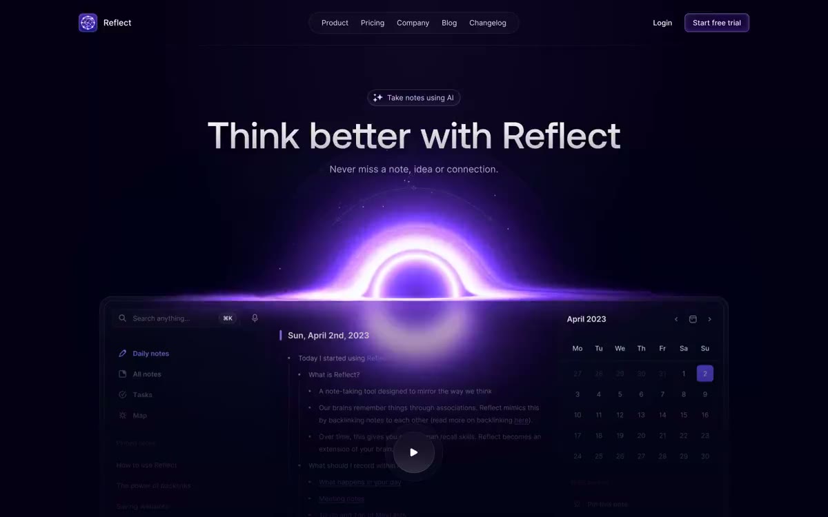
To force your AI agent to build a Reflect-style editor or notes UI, use these parameters in your manifest:
# Reflect Design Constraints

- Background color must be a very light gray (hsl(0 0% 98%)) for light mode and a soft graphite (hsl(240 6% 10%)) for dark mode.
- Focus borders must change background opacity slightly instead of applying solid primary rings.
- Border widths must not exceed 0.5px.
2. Tinybird (Dense Data Dashboards)
Tinybird presents real-time data panels. It packs heavy charts, query inputs, and metrics into a dense obsidian dashboard.
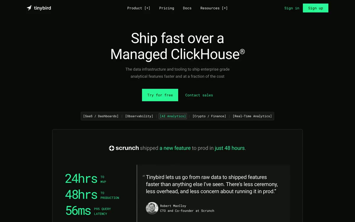
When prompting your AI to refactor an analytics layout using Tinybird tokens:
# Tinybird Layout Constraints

- Spacing padding between metric columns must be strictly capped at 1.25rem (px-5).
- Charts must sit inside cards that use a surface background of hsl(240 4% 8%) and a subtle glow on the left border.
- Font sizes for numbers must be tabular-nums for vertical alignment.
3. Auros (Premium Obsidian and Glow)
Auros utilizes high-contrast dark tones combined with neon-violet accents and deep shadow glows.

Instruct your AI coding assistant to output this style by copying these rules:
# Auros Visual Rules

- Accent color is a brilliant violet (hsl(255 100% 60%)).
- Interactive components must feature a border gradient shifting from border to accent.
- Shadow rules must include a custom glow definition: --shadow-glow: 0 0 20px 2px rgba(124, 58, 237, 0.12).
4. Harness (Enterprise-grade SaaS Primitives)
Harness targets professional developer workflows. It uses structured grid rows and precise status badges.
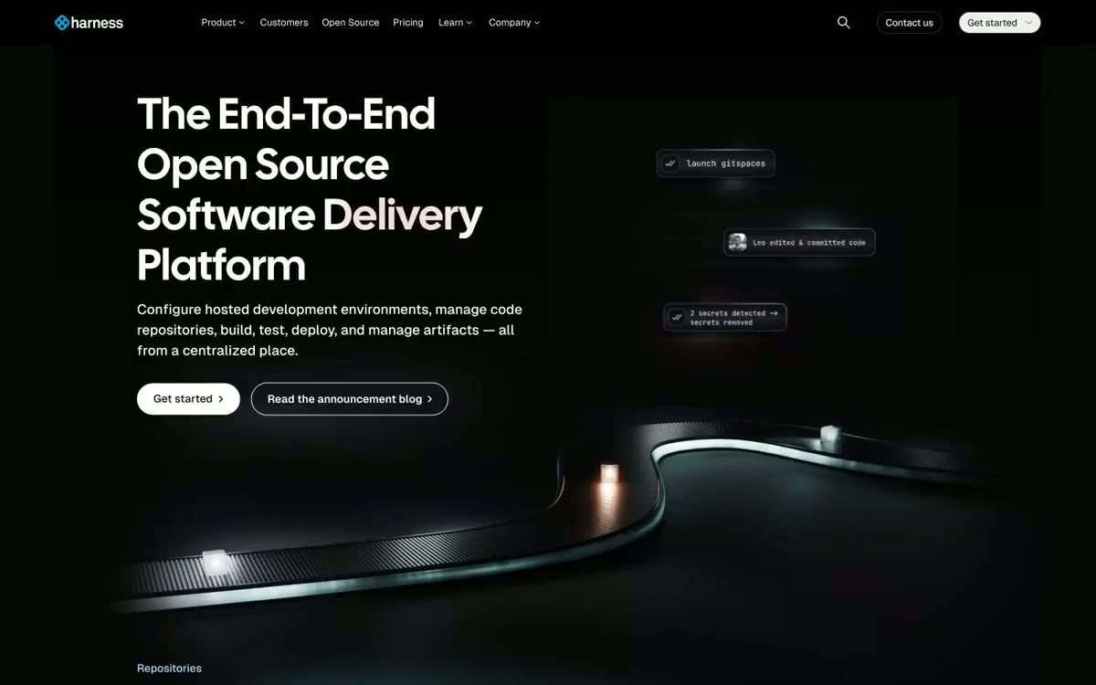
To map Harness interfaces in shadcn/ui:
# Harness Styling Rules

- Table rows must alternate background between background and surface-hover.
- Status indicator dots must be centered and have a 1px solid border matching their semantic color (e.g. green-border for green-dot).
5. Svelte (Developer-centric documentation layouts)
Svelte uses a distinctive layout optimized for documentation, syntax highlights, and code previews.
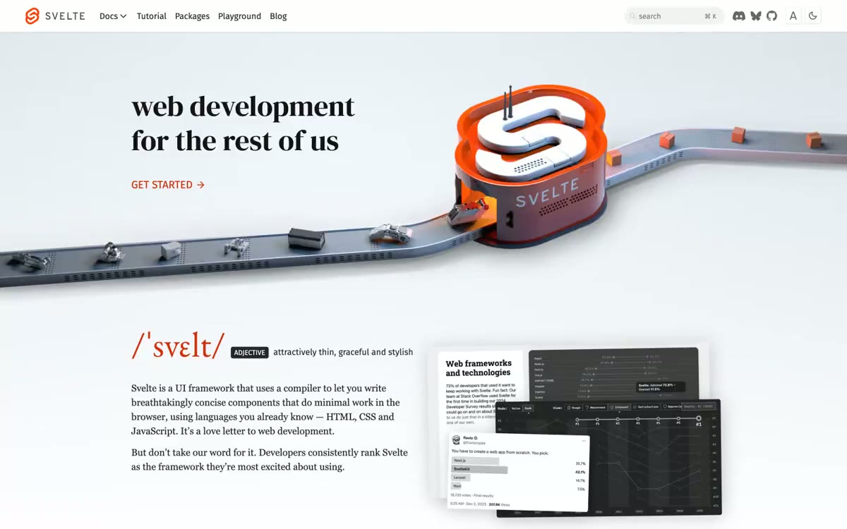
To align documentation blocks:
# Svelte Documentation Guidelines

- Code blocks must sit on a background of hsl(240 5% 5%).
- Main headings (h1, h2) must use a geometric sans font with a tracking-tight letter spacing.
Verification Pipeline
Grounding the LLM is only half of the challenge. The final step is verifying that the generated UI complies with your system rules. I run a strict test routine on my workspace before compiling releases:
- Static Analysis: Let typescript check for type safety and compilation errors using
pnpm check-types. - Linting Verification: Verify that components do not violate standard rules using
pnpm lint. - Prettier Enforcement: Run formatting to ensure consistency across indentation and CSS property sorting:
pnpm format:write. - Build Optimization: Compile the production build via
pnpm buildto verify Next.js static asset optimization and Tailwind compilation targets.
If the agent generates code that references undefined CSS properties, the Tailwind compiler will output warnings, and typescript will catch missing configurations immediately.
Conclusion
Placing a DESIGN.md file in your repository shifts the role of your AI assistant from an unguided generator to a precise design-system operator. By combining the inspiration of styles.refero.design with the structure of getdesign.md, you ensure that your Next.js and Tailwind applications maintain a premium, custom identity.
Add a DESIGN.md to your repository root, launch a clean session of your AI coding tool, and start building.