
Development of a vibrant landing page for
The Design Philosophy: Fueling Nostalgia with Modern UI/UX
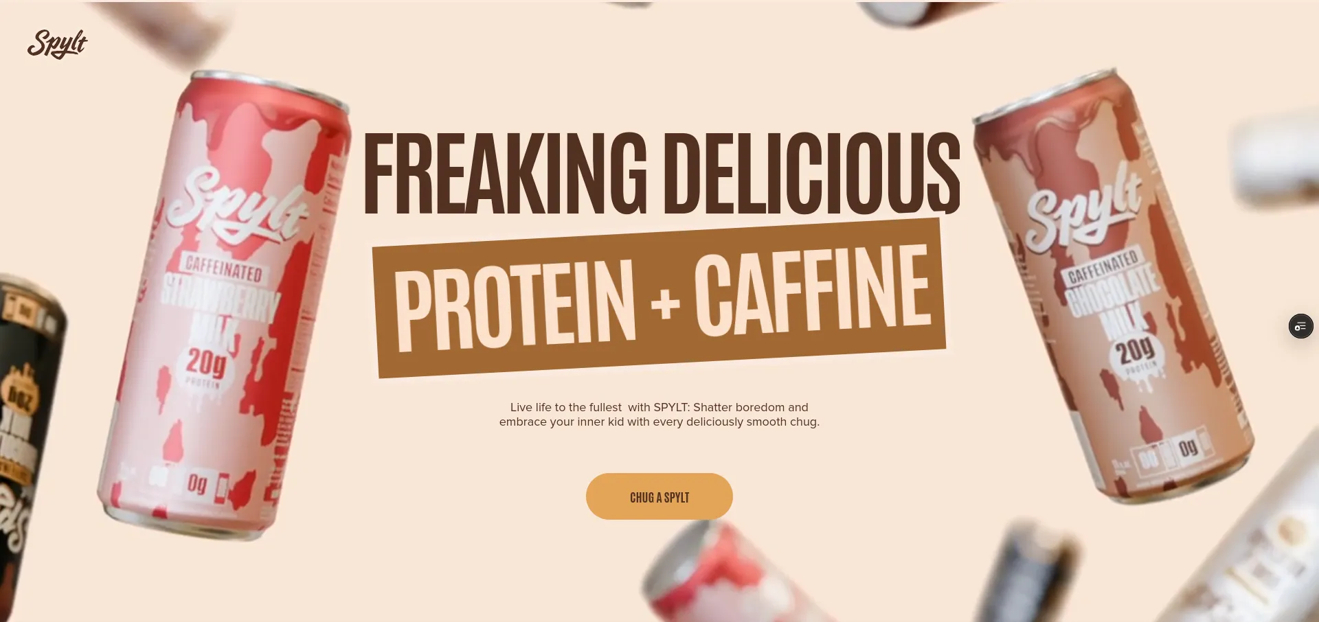
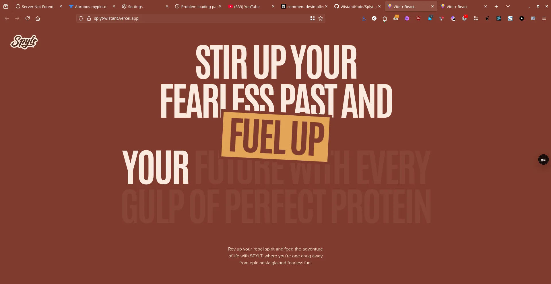
The development of the Splyt landing page was rigorously guided by a philosophy of vibrant energy, playful nostalgia, and an unwavering commitment to a premium user experience. Each section, every animation, and every interactive element was designed to communicate Splyt's unique brand ethos with an elegance and impact that sets it apart in the beverage market. The overarching goal was to create an interface that not only functions flawlessly but also feels as exciting, delicious, and meticulously engineered as the product it represents.
Visual Language and Color Palette
The visual language of the Splyt landing page employs a sophisticated yet playful palette of rich browns, creamy whites, and vibrant accents, reminiscent of classic milkshakes and indulgent treats. This choice of colors evokes a sense of deliciousness, comfort, and nostalgic fun. Typography is bold, dynamic, and highly legible, ensuring optimal readability for product information while maintaining a premium, energetic aesthetic that captures the brand's adventurous spirit.
Micro-interactions and Animations
Leveraging Framer Motion, the landing page incorporates fluid animations and subtle micro-interactions that significantly enhance user engagement without ever distracting from the core message. Elements subtly animate into view, product visuals pop with dynamic transitions, and calls to action provide satisfying feedback. These animations contribute profoundly to the premium feel of the UI, guiding the user's eye and reinforcing the brand's commitment to a "fearless fun" experience.
Flavorful Features: Showcasing Product Excellence
This section of the landing page was meticulously designed to convey Splyt's diverse and "freaking delicious" flavor offerings, emphasizing product excellence and consumer appeal through compelling visual storytelling.
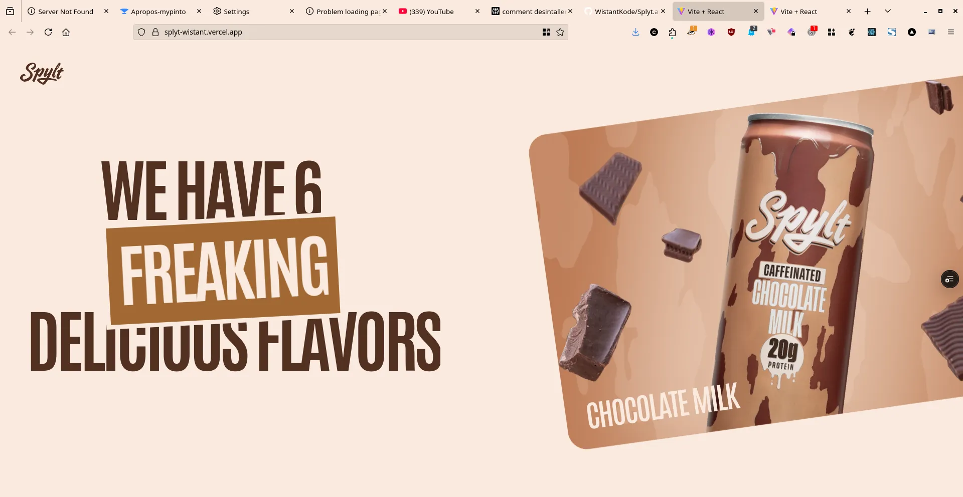
The UI visually reinforces Splyt's commitment to taste and variety. Through clean product photography, clear informational blocks, and a sense of structured presentation, the landing page communicates the six distinct and indulgent flavors: Chocolate Milk, Strawberry Milk, Cookies & Cream, Peanut Butter Chocolate, Vanilla Milkshake, and Max Chocolate Milk. This design choice aims to provide users with immediate understanding of the product's deliciousness and wide appeal.
Nutritional Transparency: Designing for Trust
Splyt's landing page emphasizes nutritional transparency, building trust with consumers by clearly communicating the health benefits and quality ingredients of the drink.
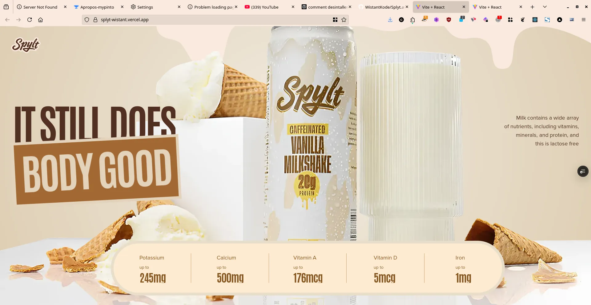
The UI visually articulates how Splyt "still does Body Good." Through clear infographics and concise text, the landing page highlights key nutritional facts, such as the wide array of nutrients in milk (vitamins, minerals, protein), its lactose-free nature, and specific values for Potassium, Calcium, Vitamin A, Vitamin D, and Iron. This design choice aims to provide users with immediate confidence in the product's health benefits and quality.
Key Benefits: Highlighting Unique Selling Propositions
This section of the landing page is crafted to highlight the unique advantages of choosing Splyt, emphasizing convenience, quality, and sustainability.
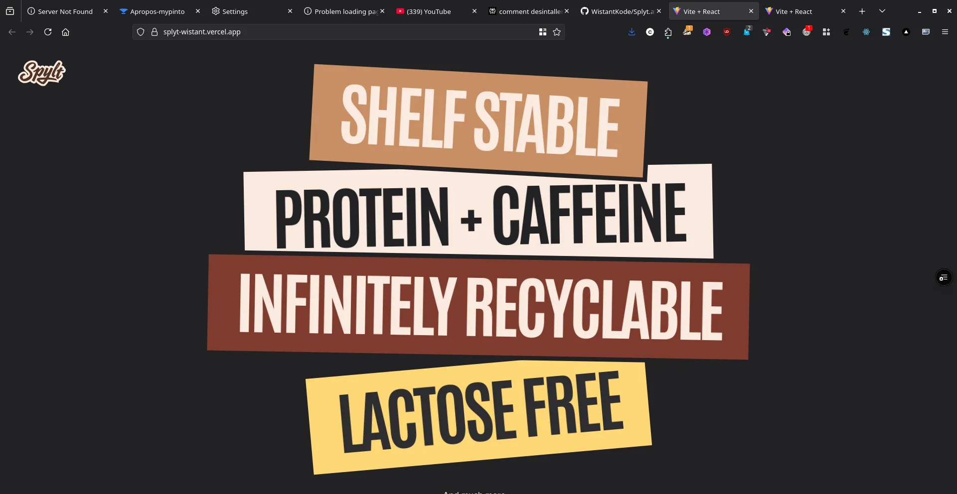
The UI visually reinforces the key benefits that set Splyt apart. Through clear, concise bullet points and supporting visuals, the landing page communicates:
- Shelf stable: Convenience for on-the-go consumption.
- Protein + Caffeine: The unique combination for energy and recovery.
- Infinitely recyclable: Commitment to environmental sustainability.
- Lactose free: Catering to dietary needs and preferences.
This design aims to provide users with a quick and compelling overview of why Splyt is the superior choice.
Community Engagement: The #CHUGRESPONSIBLY Movement
The Splyt landing page fosters community engagement and brand loyalty through interactive elements and a clear call to action for social sharing.
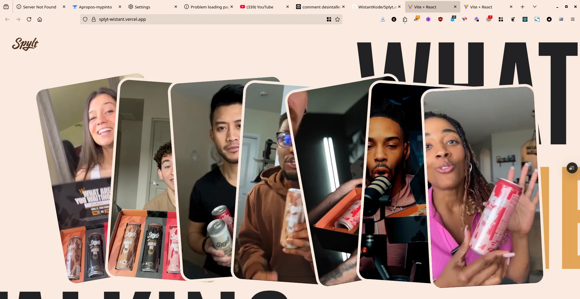
This section highlights the #CHUGRESPONSIBLY movement, encouraging users to share their Splyt experiences. The UI integrates social media cues and showcases user-generated content, creating a sense of belonging and shared adventure. This design choice aims to build a vibrant community around the brand and amplify its message.
Technical Highlights & Implementation: The Frontend Engineering Behind Splyt
The development of the Splyt landing page was a sophisticated exercise in modern web engineering, pushing the boundaries of interactive design, performance, and brand storytelling.
- Next.js & TypeScript: The robust foundation for a type-safe, performant, and scalable frontend. Leveraging server-side rendering, it ensures optimal SEO, rapid load times, and an exceptional user experience, crucial for a dynamic brand presence.
- Framer Motion: Employed extensively for fluid, engaging animations and seamless transitions. This library was key to crafting a smooth, intuitive, and delightful user interface that responds dynamically to user interactions, contributing significantly to the premium and playful feel.
- Tailwind CSS: Used for rapid and consistent UI development, ensuring a clean, modern, and responsive design across all devices. This allowed for pixel-perfect implementation of the vibrant aesthetic and efficient styling of complex components.
- Brand Storytelling & UI/UX: The entire development process was driven by a deep understanding of Splyt's brand identity, translating its energetic and nostalgic essence into every visual and interactive element of the landing page.
This project demonstrates a strong command of these technologies to deliver a visually rich, highly interactive, and technically sophisticated landing page that perfectly embodies the Splyt brand.
Impact & Conclusion: Splyt - Setting a New Standard in Beverage Brand UI/UX
The Splyt landing page successfully communicates a bold vision for a new kind of beverage brand. It stands as a compelling portfolio piece, highlighting my profound expertise in:
- Advanced UI/UX Design: Crafting intuitive, visually stunning, and highly engaging interfaces for consumer brands.
- Premium Front-end Engineering: Implementing sophisticated, performant, and highly interactive user experiences with modern frameworks and libraries.
- Immersive Brand Storytelling: Translating brand identity and product essence into captivating digital narratives through design and dynamic animations.
- Performance Optimization: Ensuring a smooth and responsive experience even with rich interactive elements, maintaining a high standard of web performance.
This project underscores my exceptional ability to translate abstract brand concepts into tangible, exciting, and engaging digital experiences, setting a new benchmark for beverage brand landing page innovation and premium UI/UX.
Copyright © 2025 Splyt - All Rights Reserved