
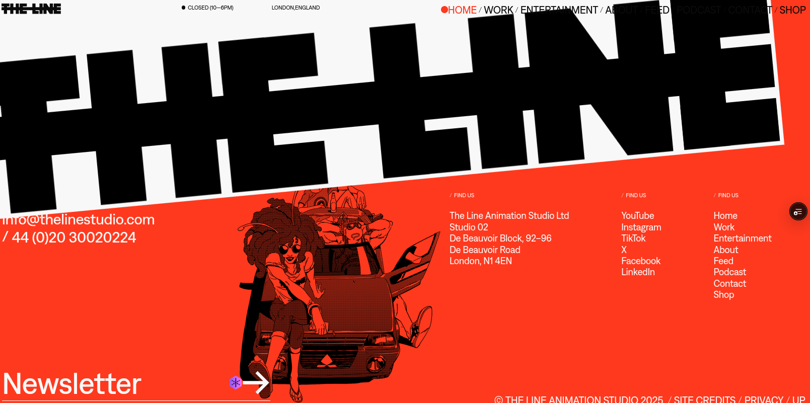
A high-fidelity frontend recreation of the official web portfolio for The Line, a premier London-based animation studio. Features advanced media handling, brutalist grid layouts, and custom camera HUD overlays.
Welcome to the detailed case study of The Line Studio Portfolio, a high-fidelity frontend clone of the official web portfolio for The Line, a globally renowned animation studio based in London.
Project Motivation: Perfection of UI/UX Engineering
Most developers build standard dashboards, generic landing pages, or basic portfolio templates when seeking to improve their skills. While these projects teach the fundamentals of web frameworks, they rarely push a developer's visual execution limits or challenge their understanding of raw user experience (UX) interactions.
Replicating an award-winning site like The Line serves a specific purpose: to bridge the gap between design concepts and production-grade frontend engineering.
By choosing to clone an active, production-proven website, the project focuses on:
- Mastering Visual Systems: Understanding how high-end design agencies use whitespace, typography sizing, and alignment to create a premium aesthetic.
- Handling Real-World Constraints: Solving the complex performance, browser policy, and layout bugs that occur when dealing with multiple autoplaying videos and dynamic timeline animations.
- Validating Execution Capacity: Proving that one can recreate any design layout, no matter how non-standard, without relying on component libraries or pre-styled templates.
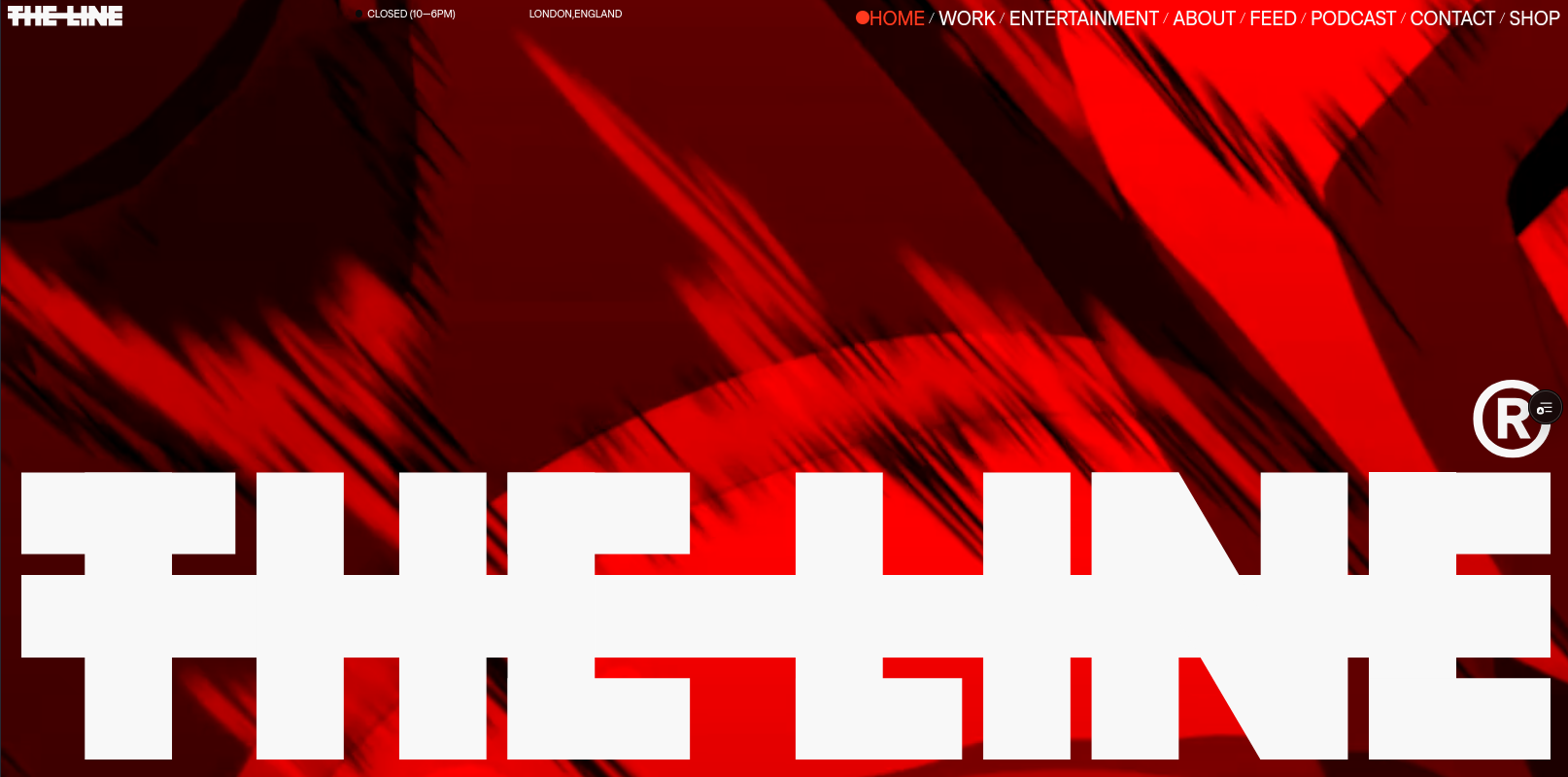
Technical Aesthetics: The Viewport Camera HUD
One of the central features of the portfolio is the custom Camera HUD (Heads-Up Display) Overlay. Modeling professional cinematography viewfinders, this persistent layout outlines the viewport with editing guides, safe zones, and camera telemetry.
To build this HUD layout cleanly:
- Overscan Border Bounds: Absolute-positioned panels frame the viewport. Instead of basic CSS borders, these use precise margins to establish a 5% safety boundary.
- Action Safe and Title Safe Outlines: SVG paths are used to render the crop and alignment marks. SVG is chosen over CSS border styles because vectors scale sharply across different display resolutions and pixel ratios.
- Cinematographic Crop Marks: Fine ticks indicate traditional screen aspects (1.85:1 and 2.39:1).
- Telemetry Indicators: Coordinates, camera framerates, and aspect ratio metadata update dynamically, completing the studio's technical identity.
The Performance Challenge: Low-Level Video Handling
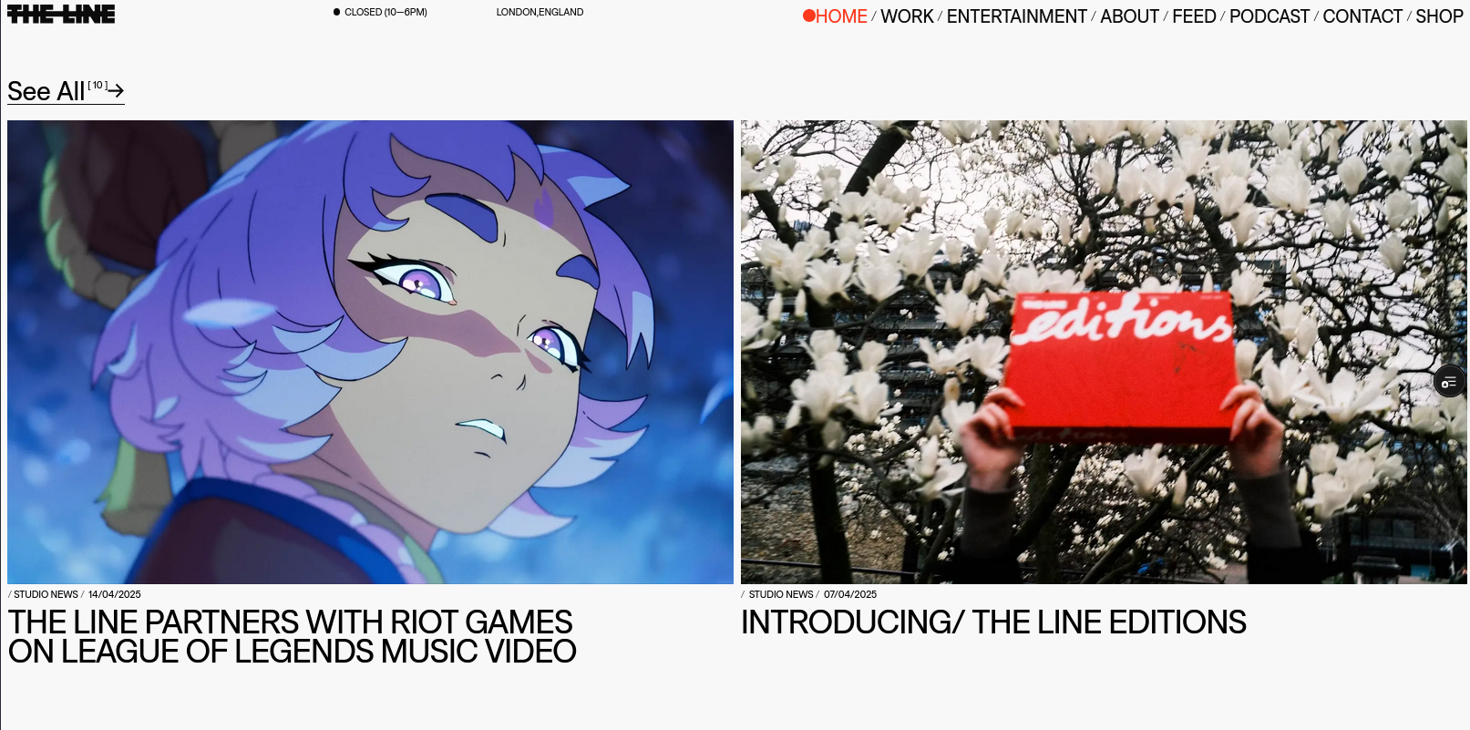
Cloning a media-first portfolio means dealing with high memory usage. The home page displays dozens of projects, each featuring dynamic hover-to-play video thumbnails.
1. Autoplay Browser Security Policies
Modern browsers block video autoplay unless the video element is muted and contains specific attribute flags. To prevent browser errors, each video component is configured with strict HTML properties:
<video muted loop playsinline preload="none" class="video-element" />When a user hovers over a project card, the playback promise must be handled carefully. If a user hovers in and out quickly, the video play request can trigger a browser exception if the pause request interrupts the loading promise. The play trigger uses an asynchronous wrapper:
const playVideo = async (videoElement: HTMLVideoElement) => {
  try {
    await videoElement.play()
  } catch (error) {
    // Autoplay was prevented or playback was interrupted before loading completed
    console.warn("Playback interrupted:", error)
  }
}
2. On-Demand Lazy Loading and Memory Allocation
Loading dozens of high-definition video files simultaneously degrades page performance. To solve this, the application uses on-demand lazy loading:
- On initial mount, video elements have no source file (
src="") and do not consume network bandwidth or memory. - When the mouse enters a project card, the source URL is injected dynamically.
- When the mouse leaves, the source URL is cleared (
video.src = "") and the browser is forced to release the buffered video stream (video.load()), garbage-collecting the decoder memory.
Animation Timelines and GSAP Integration
To match the high standard of an animation studio, all UI transitions must feel physical and fluid. The project uses the GreenSock Animation Platform (GSAP) to orchestrate complex timelines.
import { useEffect, useRef } from "react"
import gsap from "gsap"

export const useCardTransition = (cardRef: useRef, overlayRef: useRef) => {
  useEffect(() => {
    const card = cardRef.current
    const overlay = overlayRef.current

    const timeline = gsap
      .timeline({ paused: true })
      .to(overlay, { opacity: 1, duration: 0.4, ease: "power2.out" })
      .to(card, { scale: 1.02, duration: 0.4, ease: "back.out(1.2)" }, "-=0.4")

    const handleMouseEnter = () => timeline.play()
    const handleMouseLeave = () => timeline.reverse()

    card.addEventListener("mouseenter", handleMouseEnter)
    card.addEventListener("mouseleave", handleMouseLeave)

    return () => {
      card.removeEventListener("mouseenter", handleMouseEnter)
      card.removeEventListener("mouseleave", handleMouseLeave)
    }
  }, [])
}
Using GSAP timelines ensures that animations are interruptible and smooth, avoiding the awkward jumps common with CSS animations.
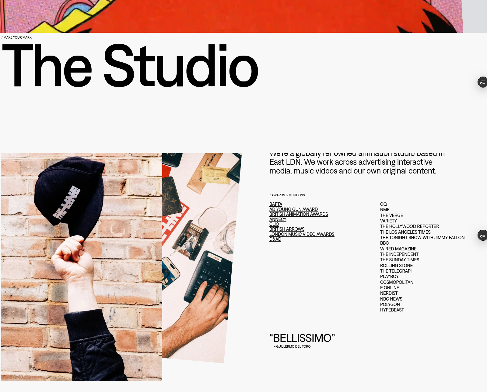
UI Components: About and Team Showcases
The About page displays the team behind the animation work and lists their brand partners.
1. Flexible Team Grid
The team profile section adapts responsively. Standard columns scale from one-column structures on mobile to five-column layouts on wide desktop viewports.
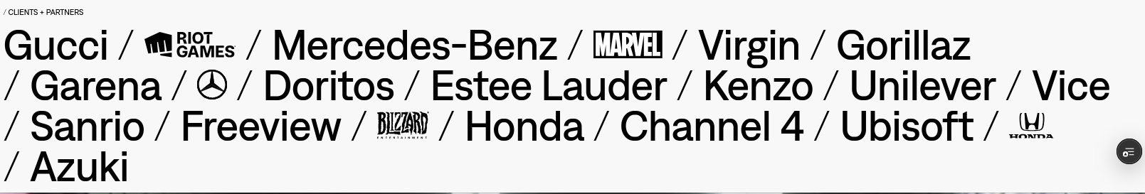
2. Partner Logo Alignment
Aligning logos with varying aspect ratios while maintaining visual balance is a common frontend design challenge. The project solves this by using a standardized logo container:
- Aspect Ratio Control: Every logo is enclosed in a square flexbox container.
- Grayscale Filters: Logos use grayscale filters (
filter: grayscale(100%)) and low opacity by default. - Hover Transitions: When hovered, the logo transitions back to full color and opacity, matching the interactive design of the original portfolio.
Project Conclusion
Building a high-fidelity recreation of The Line's web portfolio shows that creating clean user experiences requires both visual precision and solid coding principles.
By combining Next.js page generation, dynamic asset loading, and GSAP timeline orchestration, the project delivers a frontend build that matches the look and feel of the award-winning animation studio's website.