
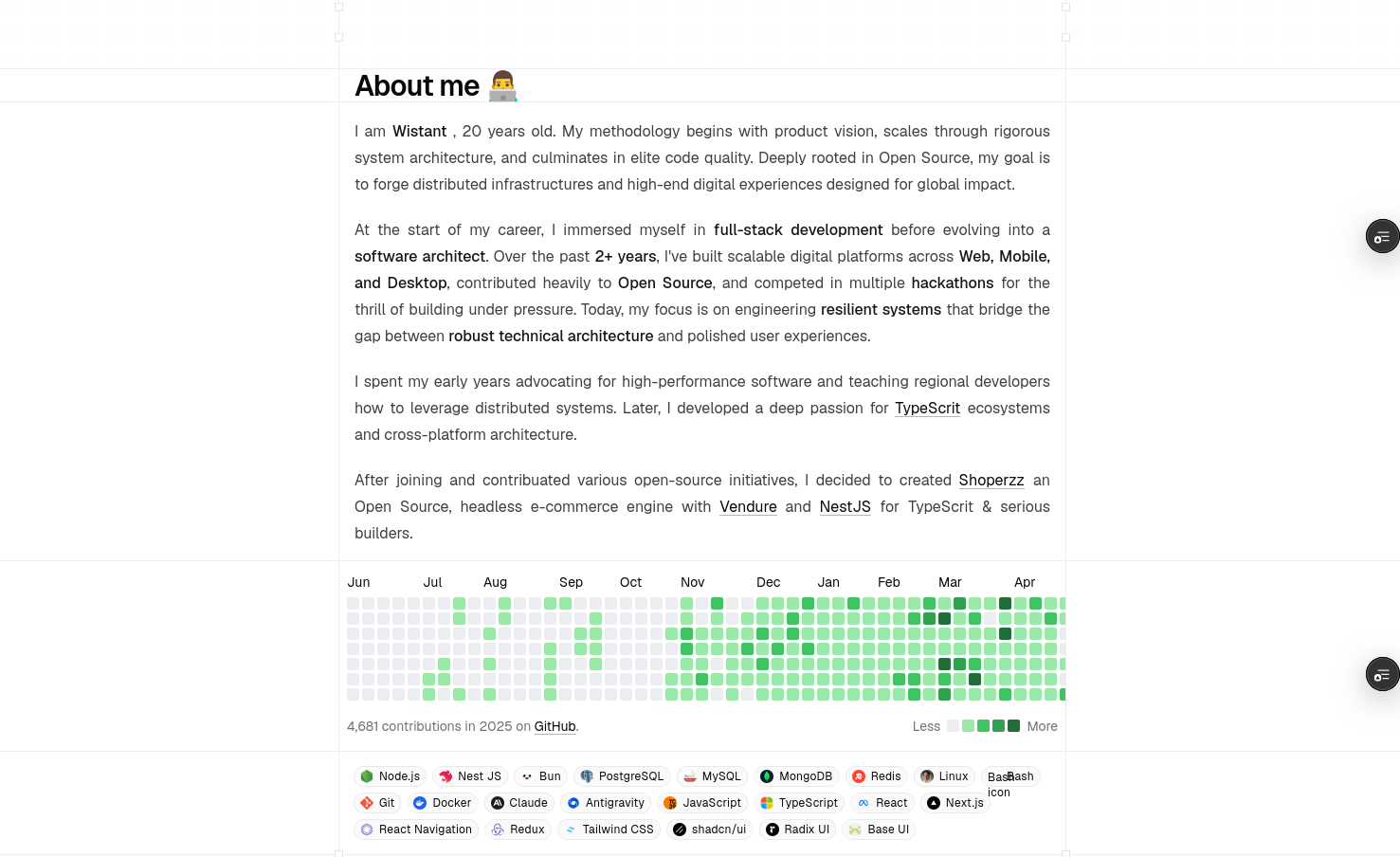
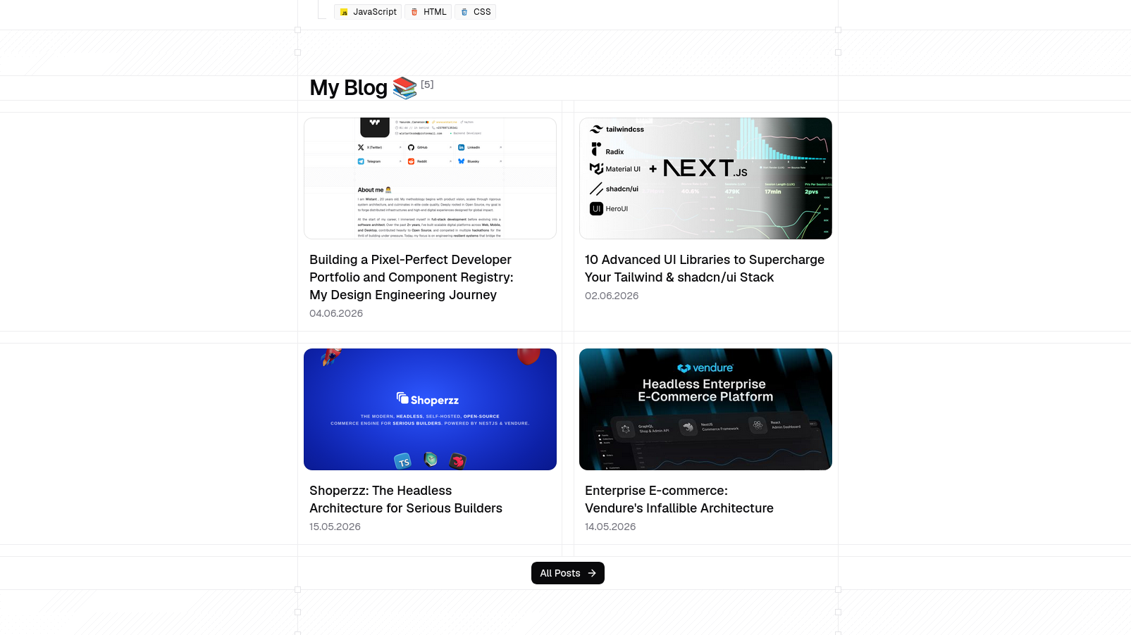
Building a Pixel-Perfect Developer Portfolio and Component Registry: My Design Engineering Journey
An in-depth look at the design engineering process, registry compilation pipeline, and aesthetic choices behind my personal space.
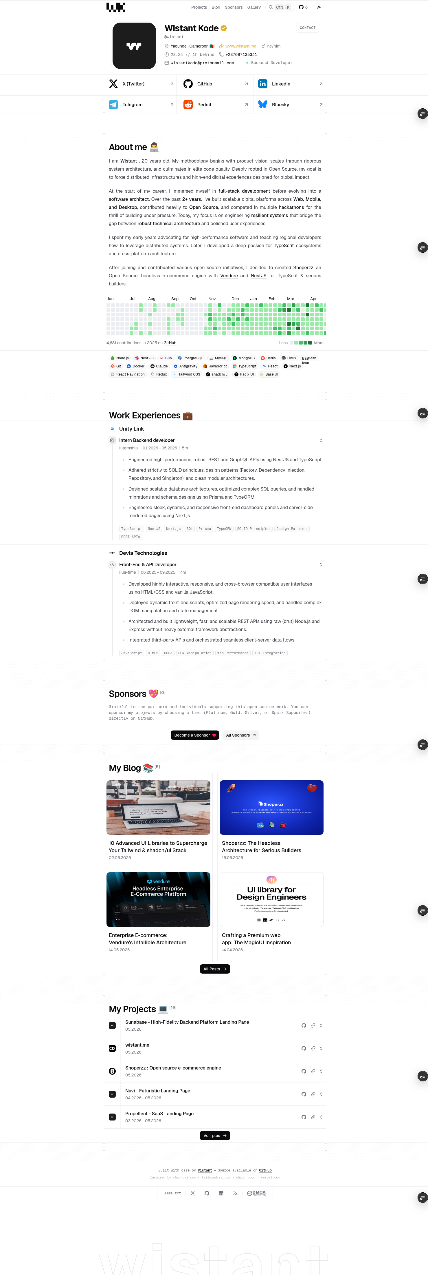
When I set out to build my personal site, I wanted to move away from standard pre-built landing pages. I aimed to construct a highly optimized, custom design-engineered platform that serves as both a showcase and a package distribution node.
In this article, I will detail the architectural choices, implementation challenges, and technical mechanisms that power this site.
The Inspiration: chanhdai.com
This project’s aesthetic and structural identity is a tribute to chanhdai.com, an exceptional portfolio created by Design Engineer Chanh Dai. I first encountered his work trending on X (Twitter), showing off screen-aligned grid lines, physical micro-interactions, and a custom mouse-tracking canvas cursor.
Inspired by his pixel-perfect design system, I set out to reconstruct this layout from scratch, adapting it to Next.js 16 (App Router), React 19, and Tailwind CSS v4.
UI Primitives & Styling Stack
To build a premium visual experience that remains accessible and performant, I combined several state-of-the-art libraries:
1. Tailwind CSS v4 & CSS Variables
Tailwind v4 is an architectural shift from v3. By replacing the JavaScript-based tailwind.config.js with native CSS variables and @theme directives inside a CSS sheet, v4 reduces compile-time overhead. It compiles utility classes directly to optimized CSS variables, improving hot-reloading speed and runtime rendering.
2. shadcn/ui & Magic UI
I leveraged shadcn/ui for basic layout structures, ensuring design system tokens (like border radii and utility values) remain consistent. For more dynamic, glowing, and eye-catching interactions, I integrated component ideas from Magic UI—specifically for canvas grid patterns, noise backdrops, and animated border effects.
3. Radix UI & Base UI
To maintain strict Web Content Accessibility Guidelines (WCAG) without styling constraints, I used headless components from Radix UI and Base UI. These libraries handle focus rings, keyboard trap layouts, and state management for complex elements like the commands menu, tooltips, dialog modals, and custom context menus.
Layout Grid & Section Engineering
The design uses dashboard-inspired borders and screen-aligned grids. Instead of simple border classes, grid dividers (e.g. .screen-line-top and .screen-line-bottom) are implemented using CSS repeating linear gradients to render custom pixel dashes:
/* Custom dashboard repeating lines */
.screen-line-bottom::after {
  content: "";
  position: absolute;
  left: 0;
  bottom: 0;
  width: 100%;
  height: 1px;
  background: repeating-linear-gradient(
    90deg,
    var(--color-line) 0,
    var(--color-line) 4px,
    transparent 0,
    transparent 8px
  );
}
This ensures our layout elements, such as the Profile Header and the main grid blocks, lock perfectly together on all viewports.
Motion, Easing, and Custom Physics
A design-engineered site relies on micro-interactions. Using static styles feels flat; using slow, linear transitions feels sluggish. I designed a physics-based spring animation system to make the layout feel natural.
Target Cursor Canvas Physics
The custom cursor (TargetCursor.tsx) uses a canvas overlay. It captures mouse coordinates and translates them onto a custom GSAP timeline. When hovering over interactive components, the cursor expands and snaps to the target's bounding box.
I synchronized GSAP’s ticks with the browser’s requestAnimationFrame and Lenis smooth-scroll loops to prevent lagging.
Easing Curve Theme Switches
For the theme switcher, I utilized Framer Motion's layout animations. Instead of fading the active indicator, the element physically stretches and slides to morph into the new tab’s bounds using a spring curve:
// Spring-based layout morphing configuration
transition={{
  type: "spring",
  stiffness: 200,
  damping: 30,
  mass: 0.5
}}
Building a Custom Component Registry
To turn this site into a utility tool for other developers, I built a custom component registry inspired by shadcn/ui. This allows me to distribute custom UI components, hooks, and blocks.
The Compilation Pipeline
The registry operates as a build-step script executed before deployment:
Component Definition: Components are written in TypeScript under
src/registry/.
AST Parsing: A compiler script (pnpm registry:build) parses the React
files, inspects their imports, and resolves their internal dependencies.
JSON Manifest Output: The script outputs JSON files to
public/r/[name].json containing the component name, required package
dependencies (like motion or lucide-react), and the raw file contents
string.
This setup lets users import complex animated elements directly into their projects via the shadcn CLI or copy-paste them with a single click.
Preventing Cumulative Layout Shift (CLS)
One of the largest contributors to poor Google Lighthouse scores is Cumulative Layout Shift (CLS). When remote or local images load after the main text, they push content down, creating a jarring shift.
To prevent this:
- Every screenshot in the blog is wrapped in our custom
<FramedImage />component. - The parent container maintains an aspect-ratio placeholder box.
- Image styles are strictly set with
width: "100%"andheight: "auto"to preserve native aspect ratios while fitting container width boundaries. - Critical above-the-fold assets, such as the dynamic profile avatar (
AvatarLights), are marked withloading="eager"andfetchPriority="high"to bypass lazy-loading queues.
Summary
Rebuilding my portfolio was an exercise in balancing aesthetic layout details with performance guidelines. By using server-side MDX rendering, Next.js App Router, Tailwind CSS v4, and custom GSAP tracking, I built a site that is visually engaging while maintaining a high-performance profile.